One great thing about Mark’s Finest Papers’ stamps is
that the line drawn images are perfect for colouring. Many card makers turn to their Copics and
alcohol markers to colour images, but what if you don’t have any Copics, or if
you just want to do something different?
Water colouring is the perfect technique!
Supplies:
Water based markers – I’m using markers from
Stampin’ Up!, but you can use any brand including Distress Markers, Memento, or
even Crayola. That said, colours from
cheaper brands may not stay true when wet so you may wish to test on a scrap
piece of paper before beginning. You can also try this technique with water
based ink pads.
A water brush – I’m using a self-feeding type
with a water reservoir that constantly feeds the brush tip, but feel free to
use a regular paint brush with water.
Paper towel – for blotting and clean up.
An acrylic block – to use as a palette. You can also use a Craft Sheet if you prefer.
Stamps – I’m using an image from Mark’s
Finest Paper’s set called Humming Along.
Water proof ink – I’m using Versafine Onyx
Black, but Staz On works really well also. It really doesn’t matter what kind
of ink you use as long as it doesn’t bleed when water hits it. You can even
heat emboss your image as the embossing will resist the ink.
Water colour paper – You can try other types
of paper, but water colour paper is best as it is designed to absorb water and
not pill like regular card stock might
Step #1 – Ink your image well and stamp.
As water colour paper is textured, make sure you press
your stamp firmly and evenly. Its a good
idea to walk your fingers over the entire image to make sure you get a good
impression.
Step #2 – Trim your image.
You can certainly pre-cut your water colour paper first,
but I find it much easier to trim down after the image is stamped, that way you
can make sure your image is perfectly straight.
It’s also easier to conserve paper that way.
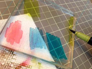
Step # 3 – Scribble the colours you’ve chosen on your
acrylic block to use as a palette. If you are using water based ink pads you
can press them directly onto your block.
I try to keep my paper towel with an edge under the
block, both to help see the colours on my block, and so I don’t have to go very
far to blot my brush if needed.
Step #4 – With a wet brush pick up your colour.
Step #5 – Colour your image. I like to start with the centre of my image
and work out.
Step #6 - Make sure to clean your brush between colours.
Step #7 – Layer your colours and blend them by allowing
the different shades bleed together.
If you find your colours aren't blending go over the area
with more water on your brush, or work in a smaller area at a time. Here is
what my image looked like at this point:
Step #8 – Repeat steps 3 -7 for each area of the image.
Here is what my image looked like at this point:
If you find some parts of the image aren't as bright as
you would like you can go back over the colours to build them up. For example, before I took this picture I had
gone back over the pink in the flower centres, and the green in the leaves to
make them a bit brighter.
The image looks complete at this point, and you can stop
here if you like, and sometimes I do.
But what if you want to give your image more depth, or you would like a
more interesting background? The following steps show how I colour the
background of the image.
Step #9 – Choose
your background colours. I like to use
at least two, a darker and a lighter version of the same shade.
Step #10 – Add a
line of the darker colour around your image.
Step #11 – Add your
lighter colour, go right over the first line you added in order to blend.
Step #12 – Add more
colour to your palette if needed.
If you add more colour to your block, and your block had
water on it, you may notice that the tip of your marker is looking a bit like
this:
Don’t panic, your marker is not ruined. This just means that the tip absorbed a bit
of water. Leave your marker alone for a
bit and the ink will redistribute through the tip and work just like it did
before.
Step #13 – Go back
around your image with a bit more of the darker colour and/or a bit more of the lighter colour until
you are satisfied with the result. Doing
this a bit unevenly can give the background more interest.
My final image looks like this:
The thing about water colour is that it is its fun, and
you don’t have to be precise. You don’t
even have to stay in the lines if you don’t want to as going outside the lines can
look more artistic. Really, there is no wrong way to do this and what more can
you ask for from a technique?
If you'd like to see the card I made with my final image please click here. :)


Cathy,
ReplyDeleteYour tutorial is awesome - as is your card - just beautiful! TFS.